After a long gap I got time to post something.. But I had to.. This is something I came across and couldn't resist sharing with you all.. This is about TATTOOS..! Many of us wanted to get inked, but end up getting meaningless permanent mark on us. So, today I will be sharing few tiny viny meaningful tattoos. Just in-case if you pick one for you.. I hope you like it.. And don't forget to share pics if you are using any of these..
Art Director & Model Maker ''Jessica Dance'' in the project ''The Comfort Food Series'' have tried to knit and sculpt food that looks relatively realistic and classic shot from a distance, then
upon closer inspection you can see the textures and detailing of the
knit.
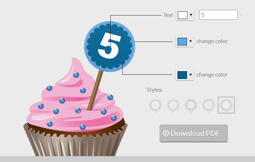
So, after a long break I am back to blogging..!! And here is the pick for the festive time.. I just came across this amazing site CUPCAKEKIT where in u can have your own printable cupcake toppers.!
Minimalist posters are really popular these days. These designs are made by Ryan McArthur, a designer who scored big with this poster series that became instantly popular.[via]
Hail Pixel Color Picker changes the screen and hexadecimal color code as the guest moves their mouse…Its an amazing tool for designers and developers..
Designed by Bessermachen | Country: Denmark “One big and beautiful box contains 12 smaller boxes and each box
represents an archetype/a personality. The personality is expressed
through a unique quote, a unique design and a unique type of chocolate. The design differentiate the 12 personalities with a diverse and
colorful use of typography and the small boxes are round like tiny hat
boxes. The chocolate is created by Coca Luxery Chocolates from unique recipes. Everything was developed from the ground. The design and the
packaging were created by Bessermachen DesignStudio, and the archetypes
and the idea were created by Stiig Helgens Binggeli / Brandhouse.” Source
"Pietro Gala" is a new premium pasta brand, distinguished by handcraft manufacturing and high quality ingredients. Fresh chicken agency developed the brand name, character and designed production package. Pietro Gala is an italian chief cook, whose image features different kinds of pasta. Cardboard texture and one-colour print emphasize naturalness of pasta and generate positive emotions." [via]
''Back to Basics'' is a personal project done by Zim and Zou.. It features all the basic technologies made out of colorful paper.. Each colorful device is cut meticulously by hand utilizing sustainable paper, and even the smallest “waste” scraps are re-used to form some of the smallest detailed components. Check it out..!!
Here is the showcase of amazing typography done by Baimu studio.. If you noticed it carefully, you can see the yummy creamy cake part is the actual typography spelling ''CUP CAKE''.. Ingredients used are paper, pencil and adobe illustrator.. Mixture of three and BINGO..!! u r done.. :)
Search engine optimization — SEO — may seem like alchemy to the uninitiated. But there is a science to it. Search engines reward pages with the right combination of ranking factors, or “signals.” SEO is about ensuring your content generates the right type of signals. Chart below summarizes the major factors to focus on for search engine ranking success.[via]
Shades of Change is an informational installation created by MarinDearie to highlight the various color changes that occur in nature, popular culture, and elsewhere
Today, have collected some amazing quotes from the famous entrepreneurs of the world.. startupquote.com is an amazing site which has inspirational start-up quotes. Here are few to motivate you..
Paris vs New York, a tally of two cities. A friendly visual match between those two cities, it is the eyes of a lover of Paris on a New York full details, clichés and contradictions: follow the guide.[via]


 Amazing Hidden Typography by


![SearchEngineLand Periodic Table of SEO small [Infographic] The Periodic Table of SEO Ranking Factors](https://lh3.googleusercontent.com/blogger_img_proxy/AEn0k_s114b1IXbQWfpxjso03Kd5eJEIIfVuzlzhDQMiFNiK5mUgSq4e2JA6RFecmR28qwMXDb5KJgVM5a2xtubP_S8N0j1Gr33EnyNID1om6uedUGzpoRaKGvE8w44uIJ_oK0QFPP-Lqrt1209XhggjsTpyqL3GMXCL724uQInSmXH-NqEHuik=s0-d)


